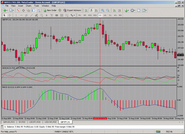
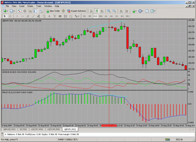
Here is a MACD with settings: fast = 8, slow = 13 and signal = 3. Notice that the movement of the blue MA pulling away from the histogram bars is reflected in the up and down movement of the price bars. At the same time the histogram colours red and green along with their varying thicknesses reflect fairly well not only the direction of the move but its apparent strength. The ADX(14) appears to confirm the interpretation of the MACD. Looking at the move identified in the one-hour chart and the 15-minute chart warns that the up-move is weakening and perhaps is about to change. This is also apparent in the MACD. Any help in the way of feedback, criticism, suggestions, improvements, refinements, etc, would be much appreciated.
Attached Image(s) (click to enlarge)
Attached File(s)