Here is a little finding of mine about range bar charts (RBC). For those of you who don't know what a range bar chart is:
http://www.investopedia.com/articles...erent-view.asp
Side note: I know a lot of you are using MT4. Unfortunately MT4 is unable to correctly build RBC. RBC must be build tick-by-tick. MT4 uses 1 min candles and interpolates the result. RBC are approximate on MT4. I built my RBC from tick historical data (source FXCM).
The only problem with the RBC is that one bar may take hours to appear or a bunch of them can pop up in no time. This is why they are perhaps better suited for automated systems. But this isn't what I want to show today.
I will show a comparison between RBC and usual time charts from the probabilistic point of view.
I'm sure all of you heard about the fat-tailed distribution of the markets. In finance, fat-tailed distribution (FTD) is associated with risk because extreme events occur "too often". In some FTD, like the Cauchy distribution, the probability of extreme events fades so slowly to zero that the risk is almost unbounded. Markets aren't Cauchy but near of.
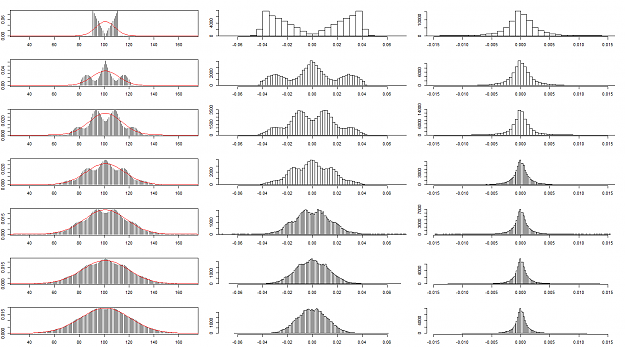
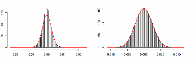
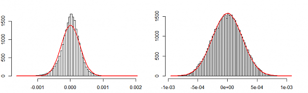
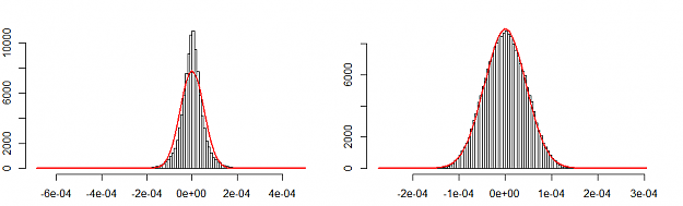
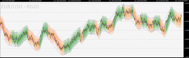
Let's start by having a look at the distribution of the market movement from bar close to bar close (return). I use E/U H1 as a reference time chart. I use a range of 20 pips on E/U for the RBC.
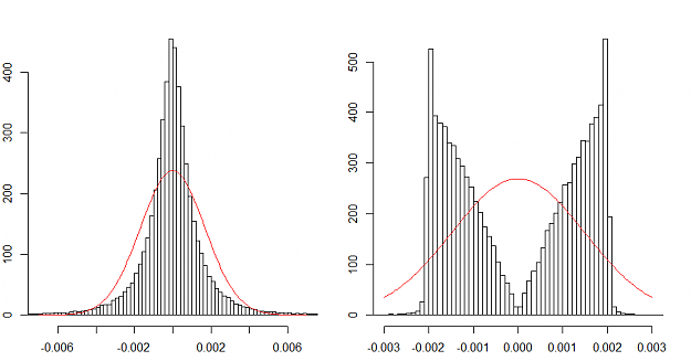
Over the historical data, for each bar, let's count how many time a given move (X pips) occurred. The result is shown as a histogram. A Gaussian (normal) distribution is fitted to the charts. The time chart (left) shows the fat tails: it is where the histogram is above the normal distribution when it is almost zero on the left and on the right sides. The range chart (right) is more surprising with a bimodal distribution (two bumps). Also the time chart have the highest probability of a zero move (a doji), while the RBC has a probability of zero of having no move for the bar (per construction). The most probable move in a RBC is a full range move. This is explained because the big temporal moves are broken down into full range bars.
http://www.investopedia.com/articles...erent-view.asp
Side note: I know a lot of you are using MT4. Unfortunately MT4 is unable to correctly build RBC. RBC must be build tick-by-tick. MT4 uses 1 min candles and interpolates the result. RBC are approximate on MT4. I built my RBC from tick historical data (source FXCM).
The only problem with the RBC is that one bar may take hours to appear or a bunch of them can pop up in no time. This is why they are perhaps better suited for automated systems. But this isn't what I want to show today.
I will show a comparison between RBC and usual time charts from the probabilistic point of view.
I'm sure all of you heard about the fat-tailed distribution of the markets. In finance, fat-tailed distribution (FTD) is associated with risk because extreme events occur "too often". In some FTD, like the Cauchy distribution, the probability of extreme events fades so slowly to zero that the risk is almost unbounded. Markets aren't Cauchy but near of.
Let's start by having a look at the distribution of the market movement from bar close to bar close (return). I use E/U H1 as a reference time chart. I use a range of 20 pips on E/U for the RBC.
Over the historical data, for each bar, let's count how many time a given move (X pips) occurred. The result is shown as a histogram. A Gaussian (normal) distribution is fitted to the charts. The time chart (left) shows the fat tails: it is where the histogram is above the normal distribution when it is almost zero on the left and on the right sides. The range chart (right) is more surprising with a bimodal distribution (two bumps). Also the time chart have the highest probability of a zero move (a doji), while the RBC has a probability of zero of having no move for the bar (per construction). The most probable move in a RBC is a full range move. This is explained because the big temporal moves are broken down into full range bars.
Attached Image (click to enlarge)
No greed. No fear. Just maths.