A look at the yield curve and why it is said to be the most accurate forecast of looming recession.
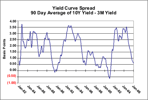
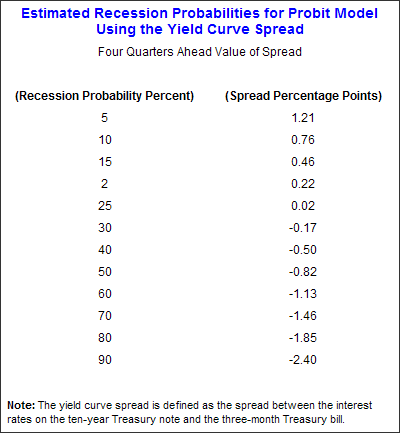
I have written about the yield curve more than any other single topic in the almost six years of writing. There is a justifiable reason to pay attention to the yield curve. In certain very specific circumstances, it has been the single most reliable predictor of recessions. Let's examine what those circumstances are.
First, the yield curve is a graphic depiction of the relationship between the yield on bonds of the same credit quality but different maturities. Normally, you expect to get more interest paid to you for holding a longer maturity, as in theory there is more risk to holding a bond for ten years than for 90 days, or for 30 years as opposed to a mere ten years.
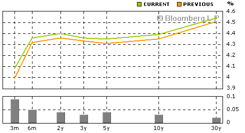
You can go to http://www.bloomberg.com/markets/rates/index.html and see an up-to-the-minute graph on the yield curve for US treasuries. At 4:00 pm Eastern time on December 30 2005 it looked like this:
I have written about the yield curve more than any other single topic in the almost six years of writing. There is a justifiable reason to pay attention to the yield curve. In certain very specific circumstances, it has been the single most reliable predictor of recessions. Let's examine what those circumstances are.
First, the yield curve is a graphic depiction of the relationship between the yield on bonds of the same credit quality but different maturities. Normally, you expect to get more interest paid to you for holding a longer maturity, as in theory there is more risk to holding a bond for ten years than for 90 days, or for 30 years as opposed to a mere ten years.
You can go to http://www.bloomberg.com/markets/rates/index.html and see an up-to-the-minute graph on the yield curve for US treasuries. At 4:00 pm Eastern time on December 30 2005 it looked like this:
Attached Image