Dear Traders,
I wanted to show you some of the trading techniques I have figured out myself over the years (+10yrs) and I use most of these to support my trades and to set up proper TP and reversal areas. I will post some seperate posts to highlight all I have and maybe we can find more hidden clues of the market.
I have to mention one very important disclaimer, all I show, has ZERO theoritical background, which means I have not seen a single book or anything that would back my ideas, only the fact that I have tested these on many charts, many different time frames and both stock and FX charts, as well as cryptos. And they just work fine. Some can be used even for price prediction, but more on that later.
Let's get to it, and I will comment the rest later. I will slowly populate the thread.
1# Technique - Finding the "real" trend lines
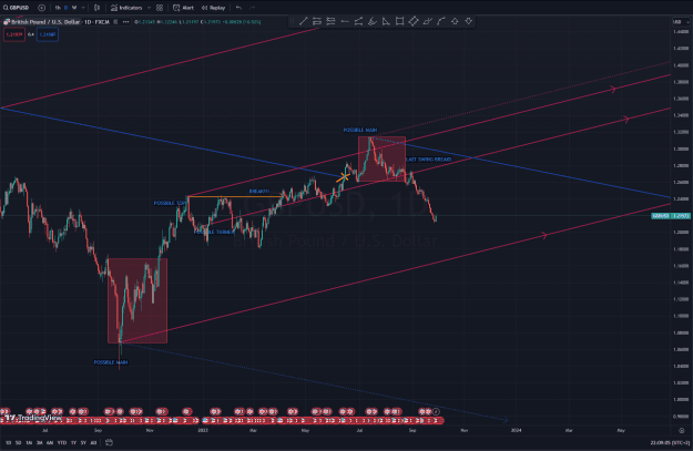
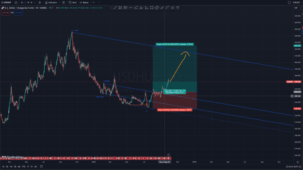
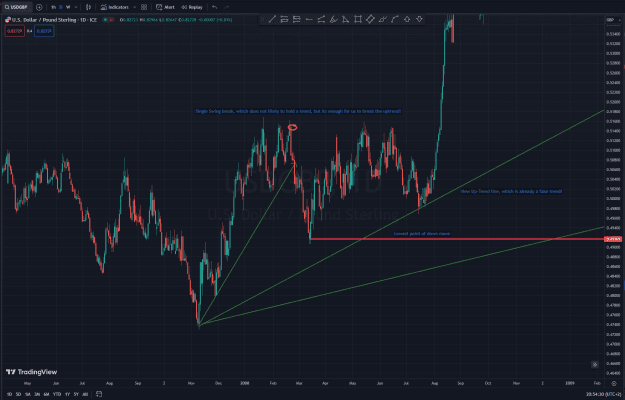
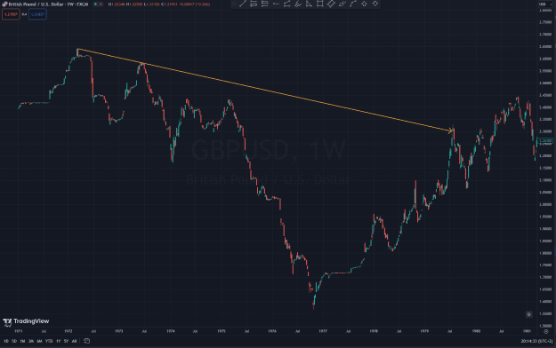
Let me give you a great example here with the following chart. GBPUSD W1
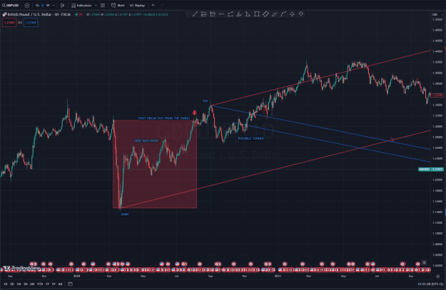
Some would set up their trend line on this pair as follows:
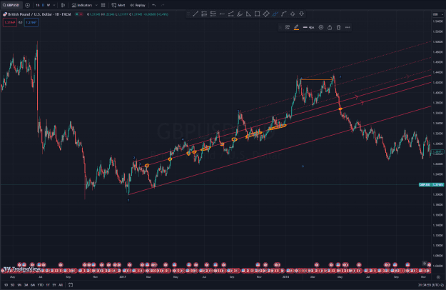
However, I see this completely the otherway around:
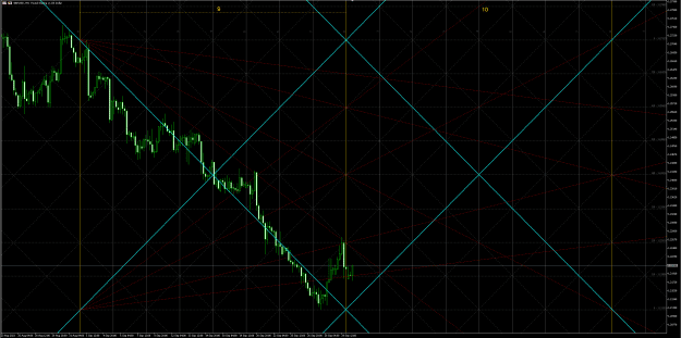
To me the following happens:
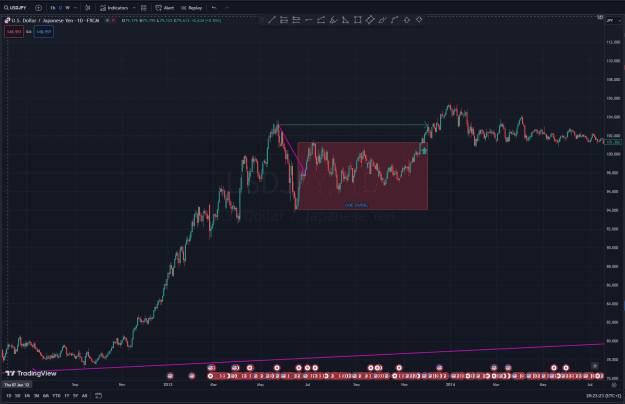
1: First trend line
2: Second trend line appears
3. Third trend line comes in
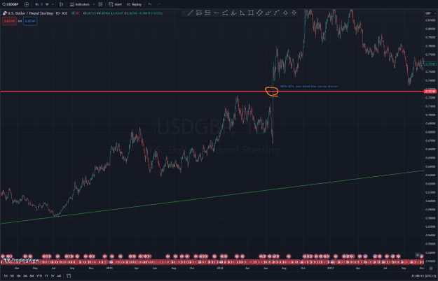
4. Third trend line breaks, without having a proper uptrend formed under it, there is sign of an actual multi swing structure of higher lows. This means to me that this is a fake breakout. Anywhere above the trendline breaking point, is an absolute good place to look for shorts as the TP is granted as the lowest point in the Third trendline. marked with the Orange circle.
After getting a new low, I can setup my channel there, by having my first major reference point in the trend. That is where I am to close my shorts as its a likely palce for correction.
5. Marked are for prepping our shorts.
6. Is an area where the pair is oversold, so if you are still in the trade its a good place to start thinking of closures and plan reversals.
7. Is the first uptrend that forms, and it actually breaks, which means that trend has failed, and technically the current downtrend should make a new LOW, which we see that it fails to do as the very next swing makes a new high.
8. Marks the new "fake" uptrend
9. Is the point where the downtrend ended.
To me the above analisys means that the point 7. is the key to me. That tells me that what ever upmove we have is a failure, and eventually the price needs to correct it back!, so technically anywhere above the point where the actual downtrend has ended, is already a good place to start looking for entries.
About that I know its like, "DUUUUDE ITS BEEN STILL GOING UP FOR WEEKS OR MONTHS..." As it can do that, since the "fake" uptrend, is still a push for newer highs. But it holds the key, that we already have a point where the upcoming downtrend will push the price.
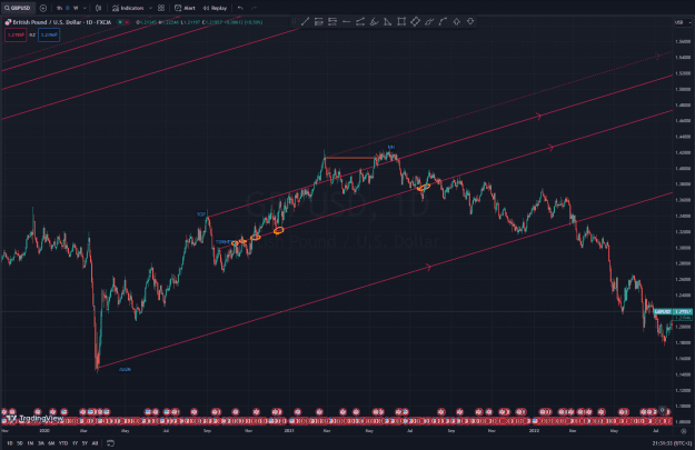
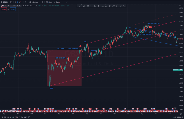
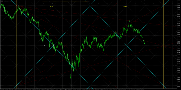
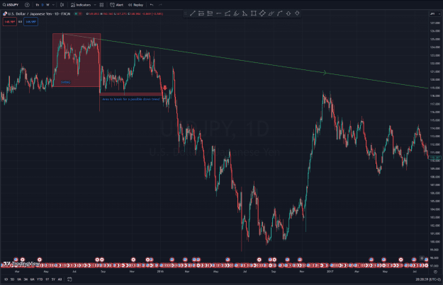
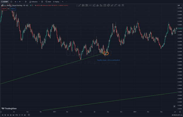
The next screenshot shows, how this played out:
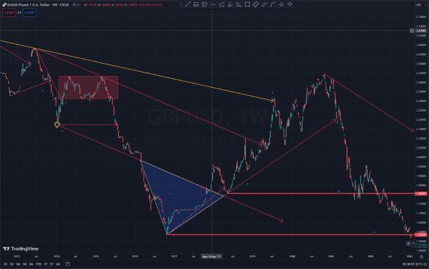
10. is the place of the "error" that needed correction
11. Is the new low that we were waiting for.
I will post the very next example on this chart, and I hope that will help you realize the power of this information:
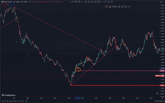
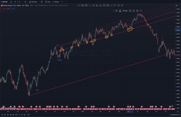
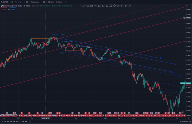
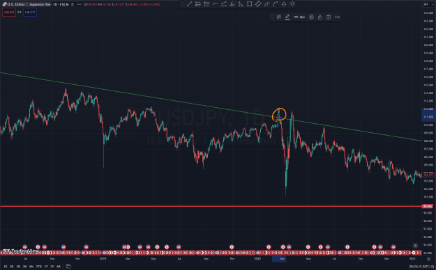
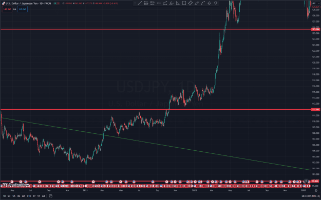
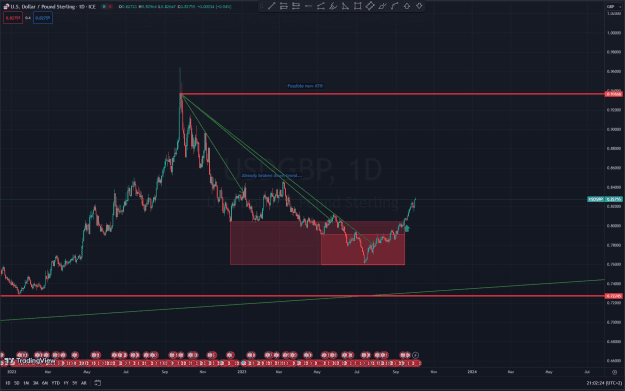
The very next uptrend failed as well, marked with the orange circle. And I would check the price levels and the dates there.
The error happened in 1985!!
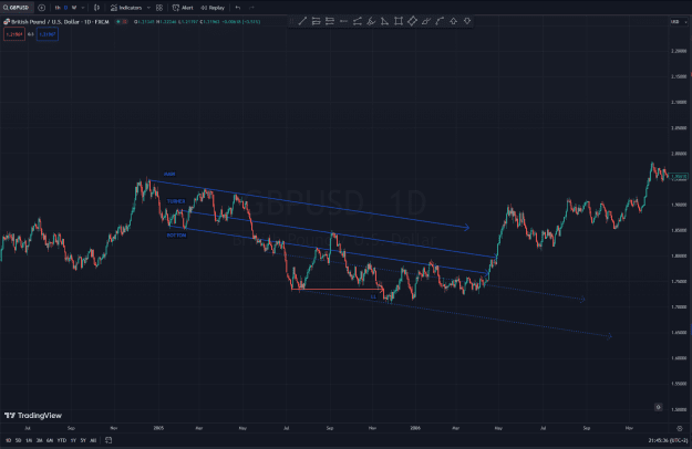
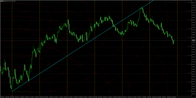
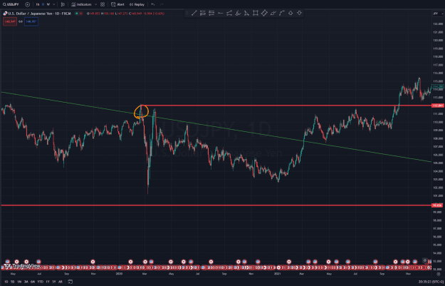
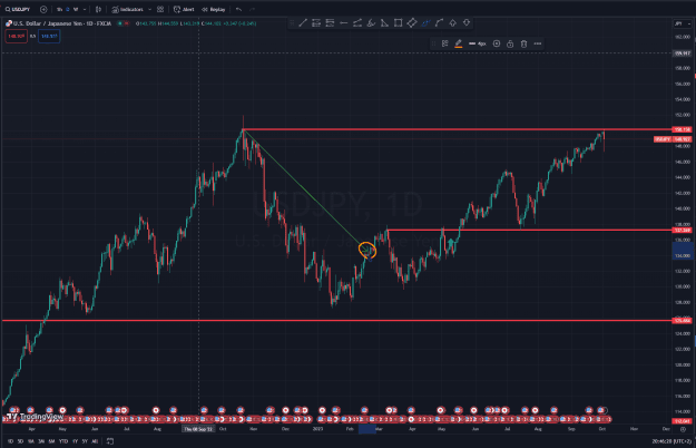
And Now look at how it has been corrected and in what way:
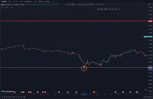
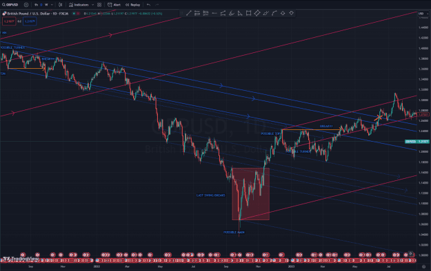
This is the Hourly chart on the same pair: Sept 26 2022 - 37 years later!!! The pair corrected the missing low, only with 1 candle!
To me this means that any errors that happened on the pair, until now, will now be started to be corrected back. So I would say, the long fait of this pair is that the GBPUSD will go northbound.
A Qucik recap of what happened with this pair. As some of you look for a 1/3 vs 2/3 ratio:

Basically anywhere in the red zone, which is the breaking point of that first fake trend, is that ratio.
Now I Know that this is a terribly long period. But this works on smaller time frames too. The reason why I like to do this on the weekly chart is to give me an overview on where we are, which is the main direction, and from there I can capture corrections on the daily chart, and ever smaller moves on the houry.
It is always wise, to look back the charts for its absolute lows and highs when trying to look up the historical trends.
I will be coming with another interesting find, using the same chart. See you in the next comment!
I wanted to show you some of the trading techniques I have figured out myself over the years (+10yrs) and I use most of these to support my trades and to set up proper TP and reversal areas. I will post some seperate posts to highlight all I have and maybe we can find more hidden clues of the market.
I have to mention one very important disclaimer, all I show, has ZERO theoritical background, which means I have not seen a single book or anything that would back my ideas, only the fact that I have tested these on many charts, many different time frames and both stock and FX charts, as well as cryptos. And they just work fine. Some can be used even for price prediction, but more on that later.
Let's get to it, and I will comment the rest later. I will slowly populate the thread.
1# Technique - Finding the "real" trend lines
Let me give you a great example here with the following chart. GBPUSD W1
Some would set up their trend line on this pair as follows:
Attached Image (click to enlarge)
However, I see this completely the otherway around:
Attached Image (click to enlarge)
To me the following happens:
1: First trend line
2: Second trend line appears
3. Third trend line comes in
4. Third trend line breaks, without having a proper uptrend formed under it, there is sign of an actual multi swing structure of higher lows. This means to me that this is a fake breakout. Anywhere above the trendline breaking point, is an absolute good place to look for shorts as the TP is granted as the lowest point in the Third trendline. marked with the Orange circle.
After getting a new low, I can setup my channel there, by having my first major reference point in the trend. That is where I am to close my shorts as its a likely palce for correction.
5. Marked are for prepping our shorts.
6. Is an area where the pair is oversold, so if you are still in the trade its a good place to start thinking of closures and plan reversals.
7. Is the first uptrend that forms, and it actually breaks, which means that trend has failed, and technically the current downtrend should make a new LOW, which we see that it fails to do as the very next swing makes a new high.
8. Marks the new "fake" uptrend
9. Is the point where the downtrend ended.
To me the above analisys means that the point 7. is the key to me. That tells me that what ever upmove we have is a failure, and eventually the price needs to correct it back!, so technically anywhere above the point where the actual downtrend has ended, is already a good place to start looking for entries.
About that I know its like, "DUUUUDE ITS BEEN STILL GOING UP FOR WEEKS OR MONTHS..." As it can do that, since the "fake" uptrend, is still a push for newer highs. But it holds the key, that we already have a point where the upcoming downtrend will push the price.
The next screenshot shows, how this played out:
Attached Image (click to enlarge)
10. is the place of the "error" that needed correction
11. Is the new low that we were waiting for.
I will post the very next example on this chart, and I hope that will help you realize the power of this information:
Attached Image (click to enlarge)
The very next uptrend failed as well, marked with the orange circle. And I would check the price levels and the dates there.
The error happened in 1985!!
And Now look at how it has been corrected and in what way:
Attached Image (click to enlarge)
This is the Hourly chart on the same pair: Sept 26 2022 - 37 years later!!! The pair corrected the missing low, only with 1 candle!
To me this means that any errors that happened on the pair, until now, will now be started to be corrected back. So I would say, the long fait of this pair is that the GBPUSD will go northbound.
A Qucik recap of what happened with this pair. As some of you look for a 1/3 vs 2/3 ratio:
Attached Image (click to enlarge)
Basically anywhere in the red zone, which is the breaking point of that first fake trend, is that ratio.
Now I Know that this is a terribly long period. But this works on smaller time frames too. The reason why I like to do this on the weekly chart is to give me an overview on where we are, which is the main direction, and from there I can capture corrections on the daily chart, and ever smaller moves on the houry.
It is always wise, to look back the charts for its absolute lows and highs when trying to look up the historical trends.
I will be coming with another interesting find, using the same chart. See you in the next comment!