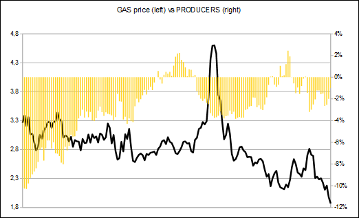
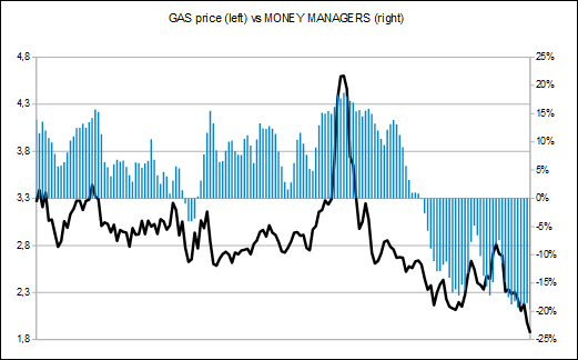
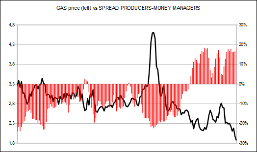
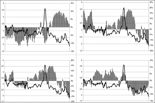
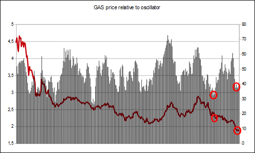
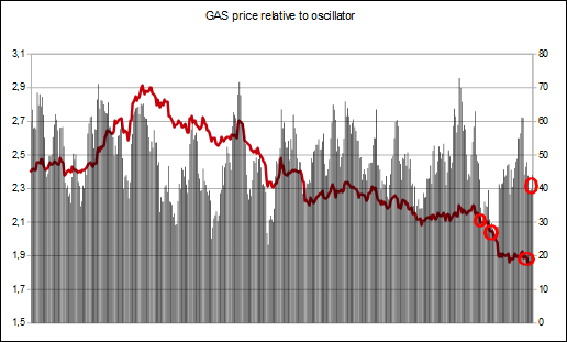
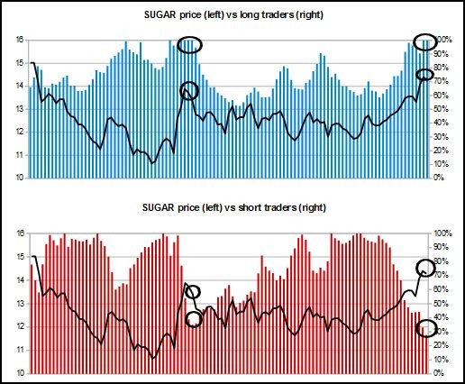
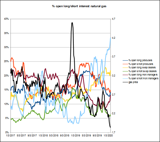
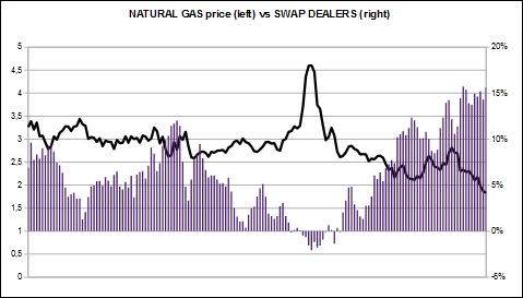
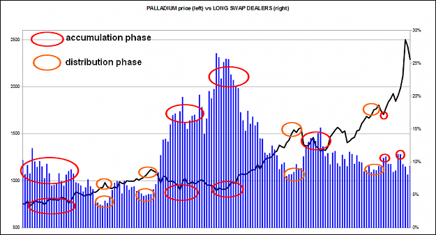
Natural gas analysing this messy chart
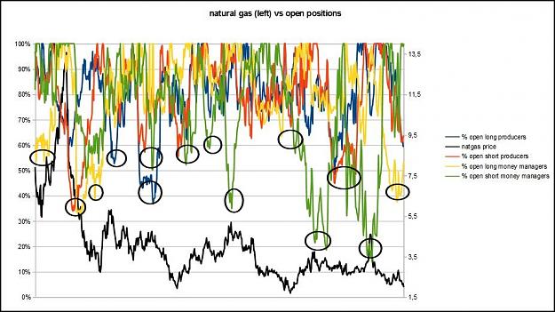
The above chart looks a total mess at first look, because its a 12 years historical chart compressed.
But every chart, every datas got patterns we can analyse in order to find opportunity of investment.
Its a weekly chart, so we have plenty of time to analyse it and its to make long term cash.
I'll just give a quick tip about it. Whenever you look at it, it looks a mess, impossible to read. But lets just filter the "big" changes of positionning.
Most of the time, its glued on top, near 100%. Just wait until producers or money managers make a move, clear positions, brining down the percentages.
You can see anytime traders are positionned towards 100% then going down towards or below (better) 60% then a potential reversal is happening for natural gas
A big change of positions obviously lead to a change of trend, or a correction.
Lately ? the longs money managers are very active, opening and clearing positions at the bottom
The next few weeks will tell if a bottom is in place
Attached Image (click to enlarge)
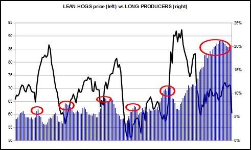
The above chart looks a total mess at first look, because its a 12 years historical chart compressed.
But every chart, every datas got patterns we can analyse in order to find opportunity of investment.
Its a weekly chart, so we have plenty of time to analyse it and its to make long term cash.
I'll just give a quick tip about it. Whenever you look at it, it looks a mess, impossible to read. But lets just filter the "big" changes of positionning.
Most of the time, its glued on top, near 100%. Just wait until producers or money managers make a move, clear positions, brining down the percentages.
You can see anytime traders are positionned towards 100% then going down towards or below (better) 60% then a potential reversal is happening for natural gas
A big change of positions obviously lead to a change of trend, or a correction.
Lately ? the longs money managers are very active, opening and clearing positions at the bottom
The next few weeks will tell if a bottom is in place
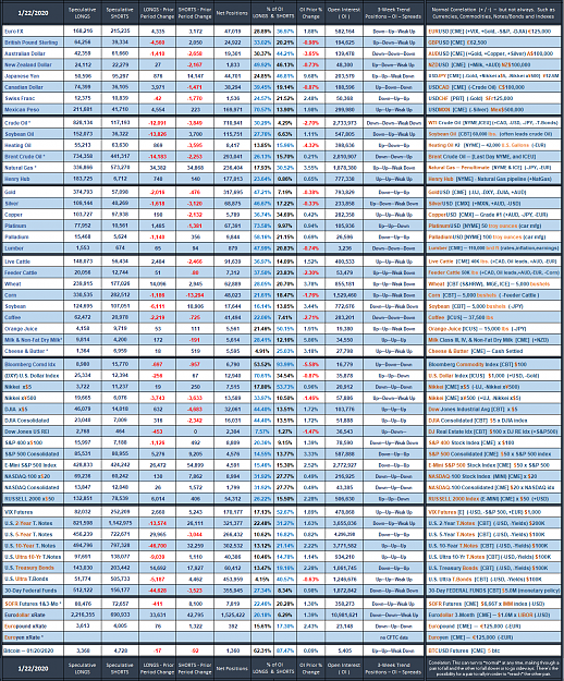
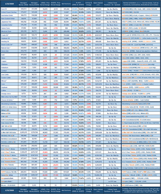
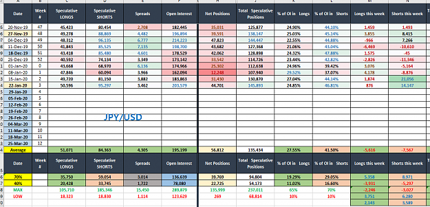
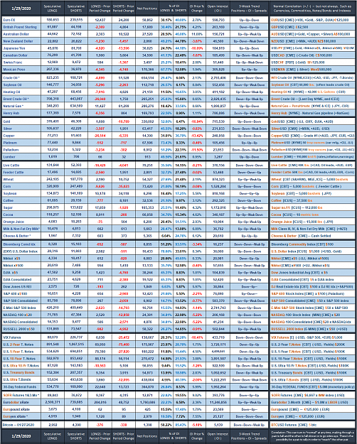
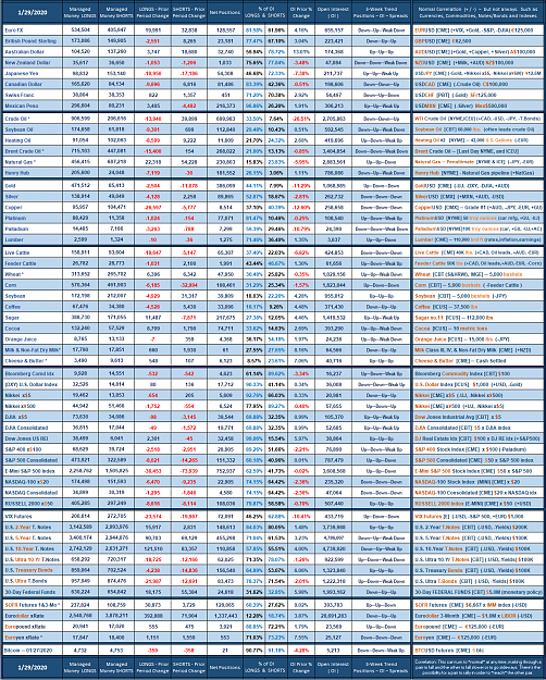
COT: The precious data ignored