You can access the Indicator from this link:
https://tradingfinder.com/products/i...ation-heatmap/
You can access the Indicator on the TradingView website:
https://www.tradingview.com/script/Q...Science-Stats/
Prop Firm DrawDown Protector : Prop Firm Capital Protection Expert MT5 |Forex Money Management: Forex Trade Management Expert MT5 | ICT Concepts Indicator MT5 |Smart Money Concepts Expert MT5 | Smart Money Trap Scanner |Get a free Expert Advisor license via Telegram and WhatsApp
Key Functionality and Real-Time Application
With its capacity for real-time updates, this indicator allows for the continuous monitoring of shifting correlations. It can identify periods of strengthened convergence or emerging divergence, offering valuable context for market structure analysis. A particularly useful feature is its ability to display major global market sessions—such as the Tokyo, London, and New York opens—directly on the heatmap timeline, linking correlation shifts to specific trading hours and liquidity events.
Indicator Specifications and Features
- Platform: Designed for TradingView.
- Skill Level: Best suited for intermediate to advanced traders.
- Indicator Type: Functions as both a reversal and multi-timeframe analysis tool.
- Trading Style: Highly effective for intraday trading strategies.
- Applicable Markets: Versatile across Forex, Cryptocurrencies, Stocks, Commodities, Indices, and ETFs.
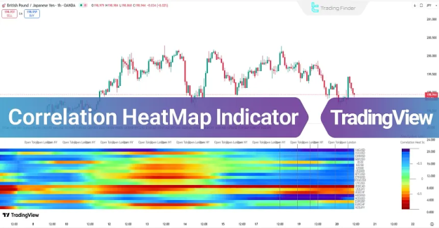
How the Correlation HeatMap Indicator Works
At its core, the indicator calculates the statistical correlation coefficient between a primary chart symbol and a user-defined set of comparative symbols. This calculation runs over consecutive price bars within a specified period. The resulting data is transformed into an intuitive color-coded matrix.
- Cold Colors (Blues/Greens): Indicate a positive correlation, meaning assets are moving in the same direction.
- Warm Colors (Reds/Oranges): Signal a negative correlation, where assets are moving in opposite directions.
This dynamic visual representation enables the instantaneous assessment of relationship strength and market regime changes.
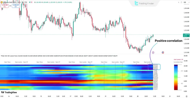
Interpreting Bullish Signals: Positive Correlation in Action
When the Correlation HeatMap transitions towards cooler tones, it signifies a strengthening positive correlation between the primary asset and its comparative symbols. This alignment often coincides with new liquidity inflows and a unified market structure. In a bullish trend, such a pattern confirms strengthening upward momentum and increases the probability of trend continuation. Traders can use this strong positive correlation as a confirming signal to enter or add to long positions.
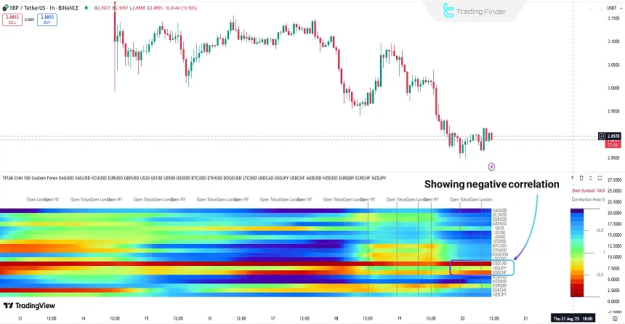
Interpreting Bearish Signals: Negative Correlation in Action
A shift in the heatmap's color spectrum towards warm areas (red and orange) highlights a strengthening negative correlation. This indicates that the primary symbol is moving inversely to major comparative assets. Typically occurring alongside price decline, this pattern reflects heightened selling pressure and liquidity exiting the market. It serves as a warning signal for potential downtrend persistence and can help confirm bearish market conditions.
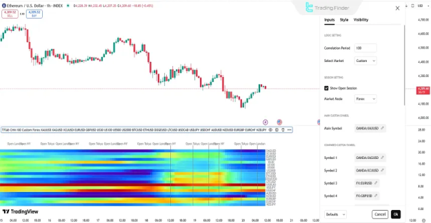
Configuring the Correlation HeatMap Indicator
Proper configuration is essential for effective use. The main settings are logically grouped for clarity.
Logic and Core Calculation Settings
- Correlation Period: Defines the look-back period (number of candles) used to calculate the correlation coefficient.
- Select Market: Allows the choice of the primary symbol and the basket of comparative symbols for analysis.
Session and Display Settings
- Show Open Session: Toggles the display of major market session openings on the timeline.
- Market Mode: Adjusts the visual presentation mode of the heatmap.
Symbol Selection Settings
- Main Symbol: Sets the primary asset for correlation analysis.
- Compared Custom Symbols (Symbol 1 – Symbol 20): Allows customization of up to 20 comparative symbols, offering flexibility to analyze specific sectors, cross-asset relationships, or a custom watchlist.
Conclusion
The Correlation HeatMap Indicator transforms complex statistical relationships into an actionable visual dashboard. By providing real-time insight into the ebb and flow of asset correlations, it empowers traders to quickly identify phases of market alignment and divergence. In bullish environments, rising positive correlation confirms trend strength and liquidity support. In bearish scenarios, intensifying negative correlation underscores selling pressure and potential downside continuation. Integrating this tool into a broader analysis framework significantly enhances market context and timing for strategic decision-making.