Prop Firm DrawDown Protector : Prop Firm Capital Protection Expert MT4 |Forex Money Management: Forex Trade Management Expert MT4 |ICT Concepts Indicator MT4 | Smart Money Concepts Expert MT4| Get a free Expert Advisor license via Telegram and WhatsApp
Supply and Demand Curve Trading Setup
What Is Supply and Demand?
Supply and demand represent the foundational forces that dictate price movements in financial markets. Demand signifies the readiness of buyers to acquire an asset at a specific price point, while supply indicates the willingness of sellers to offer the same asset at that price level.
- When demand surpasses supply, prices tend to appreciate.
- Conversely, when supply exceeds demand, prices typically decline.
This fundamental yet potent dynamic underpins numerous financial market analyses and is indispensable knowledge for every trader.
How to Identify Supply and Demand Zones?
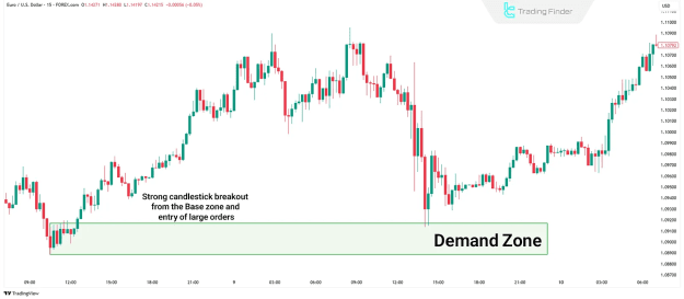
Identifying supply and demand zones involves pinpointing areas where the market has exhibited a sharp, decisive move in a particular direction, signaling a disruption in market equilibrium.
- These zones frequently emerge after a period of consolidation, often accompanied by strong candlesticks and elevated volume.
- Within such structures, the Base area must be identified first. This is the region where the price remained relatively stable for a brief period before initiating a significant move.
- A sudden breakout from this base indicates the entry of substantial buy or sell orders.
- By meticulously analyzing candlestick formations within these zones, traders can delineate areas where price is highly likely to react upon a future revisit.
Supply and Demand vs. Support and Resistance
While often confused, supply and demand zones differ fundamentally from traditional support and resistance levels:
- Support and resistance levels are derived from historical price reactions—areas where price previously halted or reversed. They are generally depicted as single lines.
- Supply and demand zones, in contrast, highlight areas of actual imbalance between buyers and sellers, where large-scale orders were executed, resulting in powerful price movements. These zones possess measurable depth, unlike mere lines.
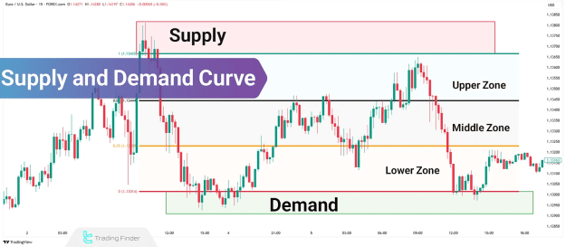
What Is the Supply and Demand Curve?
The Supply and Demand Curve offers a visual reference that pinpoints the current price's position relative to the nearest significant supply and demand zones. This tool assists traders in discerning whether the price is situated in the upper, middle, or lower portion of the curve.
- Recognizing this position significantly reduces the probability of entering unfavorable trades.
- For instance, initiating a buy trade near a supply-heavy area or a sell trade within a demand-forming zone carries a substantially higher risk.
How to Plot the Supply and Demand Curve on a Chart?
Accurately plotting the Supply and Demand Curve begins with correctly marking the supply and demand zones on your chart. Subsequently, the upper, middle, and lower segments of the curve can be drawn using two primary methodologies:
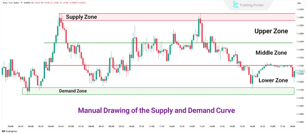
Manual Supply and Demand Curve Plotting
- Begin by identifying the proximal lines, which are the inner edges of the supply and demand zones. These lines define the boundaries of market control.
- Calculate the total number of price points between these proximal levels.
- Divide this distance into three equal parts to delineate:
- Upper zone: Positioned near the supply zone.
- Middle zone: Represents the equilibrium area.
- Lower zone: Positioned near the demand zone.
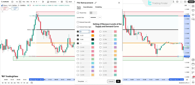
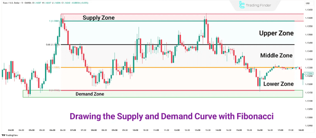
Plotting the Supply and Demand Curve with Fibonacci
To streamline the division of space between supply and demand zones, the Fibonacci retracement tool can be employed. This method eliminates manual calculations and enhances precision.
- Configure the Fibonacci tool to enable only the following four levels:
- 0%
- 33%
- 66%
- 100%
- Disable all other Fibonacci levels.
- Draw the Fibonacci tool from the proximal line of the supply zone down to the proximal line of the demand zone.
- The range will be automatically segmented into three equal parts:
- 0% to 33%: This constitutes the first zone (which could be near supply or demand, depending on the trend direction).
- 33% to 66%: This represents the equilibrium zone.
- 66% to 100%: This is the opposite zone.
Multi-Timeframe Analysis of the Supply and Demand Curve
Employing a multi-timeframe analysis approach is crucial for robust trading strategies. Higher timeframes are utilized to establish the overarching trend direction, while lower timeframes facilitate precise entry points.
- Initially, identify significant supply and demand zones on a higher timeframe (e.g., daily chart) and plot the corresponding curve.
- Next, identify internal zones on a mid-timeframe (e.g., 1-hour chart).
- Finally, execute trade entries on a lower timeframe (e.g., 15-minute chart).
This structured approach ensures that trades are aligned with the prevailing trend direction and helps to minimize risk.
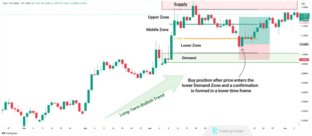
Bullish Supply and Demand Curve Trading Setup
In a bullish market trend, such as observed on the daily chart of EUR/USD:
- As price enters the lower zone of the curve (near the demand area) and a confirmation signal emerges on a lower timeframe, a long position becomes highly favorable.
- This entry gains significant validity when the lower timeframe demand zone aligns precisely with a higher timeframe's crucial demand zone.
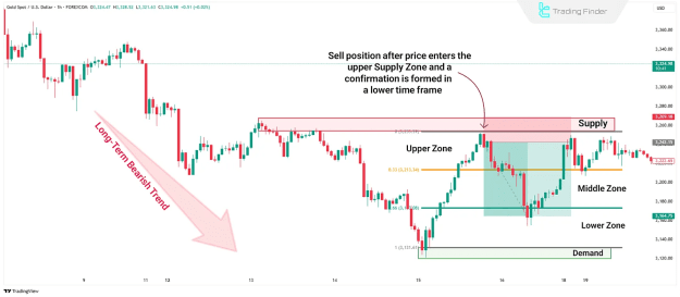
Bearish Supply and Demand Curve Trading Setup
In a bearish market trend, exemplified by the 1-hour chart of Gold (XAU/USD):
- After a corrective move, the price enters the upper zone of the curve. This area often overlaps with a significant supply zone.
- Evidence of weak buyer activity and increasing selling pressure on a lower timeframe provides a strong validation for a short setup.
- When this zone perfectly aligns with a higher timeframe's dominant downtrend, the probability of the trade's success significantly increases.
Conclusion
Supply and demand analysis achieves greater efficacy when the price's precise position on the Supply and Demand Curve is known. This curve effectively categorizes price into upper, middle, or lower regions, guiding traders toward more informed decisions. It can be plotted either manually or by leveraging the Fibonacci retracement tool.
The integration of multi-timeframe analysis further refines this strategy, allowing traders to define the overarching trend from a higher timeframe and pinpoint optimal entry points on a lower one. When internal zones on lower timeframes converge with the primary zones identified on higher timeframes, the probability of trade success is substantially enhanced. The synergistic combination of these techniques ultimately leads to lower-risk and potentially more profitable trade entries.