- Search Metals Mine
- 23 Results
-
 Super_Mario replied Aug 7, 2014
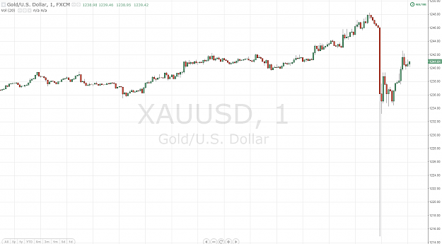
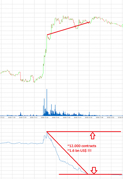
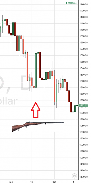
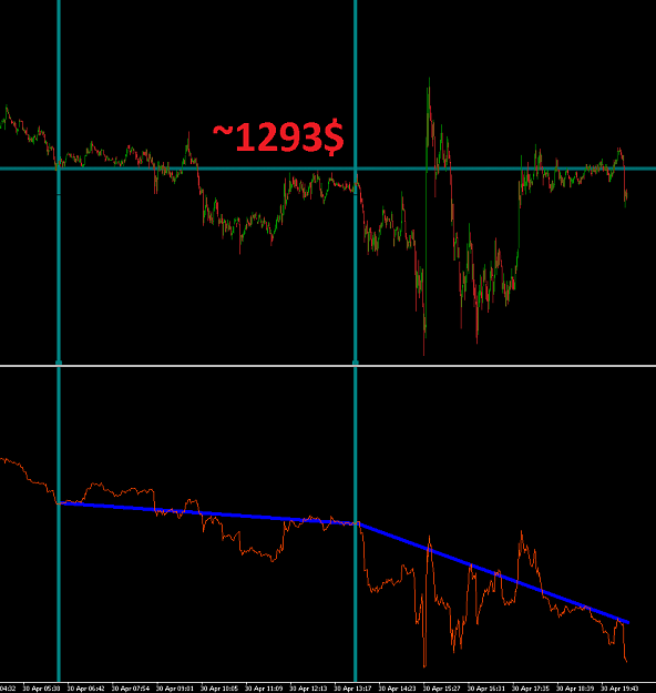
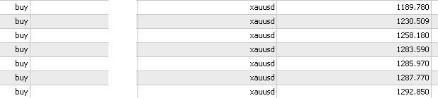
Returning back to yellow metal. This is yesterday's situation : image Yesterday we reached that point where things get simple Who sold gold ~1.6 billon US$ worth during yesterday's session? Who managed to sell this large amount, not only WITHOUT ...
Only Gold!
- Super_Mario replied Aug 6, 2014
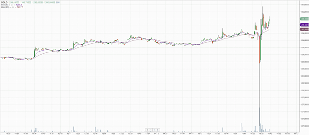
One of those "F*ck Yeah!" moments I believe? CT? image Difficult not to get overexcited, but still hope everybody can control themselves
Only Gold!

- Super_Mario replied Jul 18, 2014
Yea. "This happened before, it will happen again"(c)Armageddon movie starting titles 19.09.2013 Ben Berdanka/FOMC : image But Gold was going DOWN.
Only Gold!
- Super_Mario replied Jun 18, 2014
Just a small reminder for those who are trying to decide whether to short or long Gold before FOMC announcements image
Only Gold!
- Super_Mario replied May 20, 2014
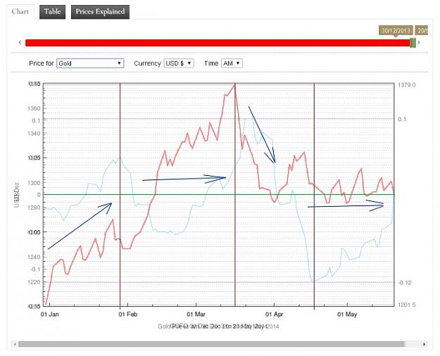
As you say GOFO rates were negative but there was no noticeable price increment. Nevertheless, with positive GOFOs we got Jan-Feb rally. Below I photoshoped price graph onto GOFO graph image
Only Gold!
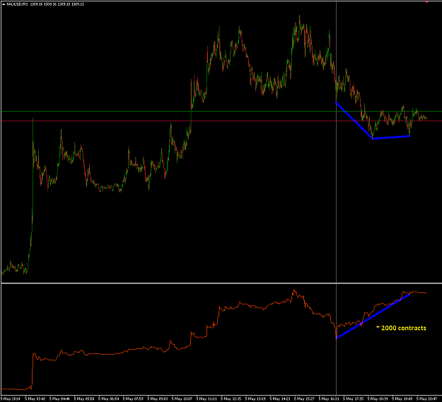
- Super_Mario replied May 12, 2014
Small explanation, but i assume that's already obvious image
Only Gold!
- Super_Mario replied May 7, 2014
what she said? all i see is that ETFs are still butthurting and selling off, almost in panic. however, what they sell is very welcome by buyers : image
Only Gold!
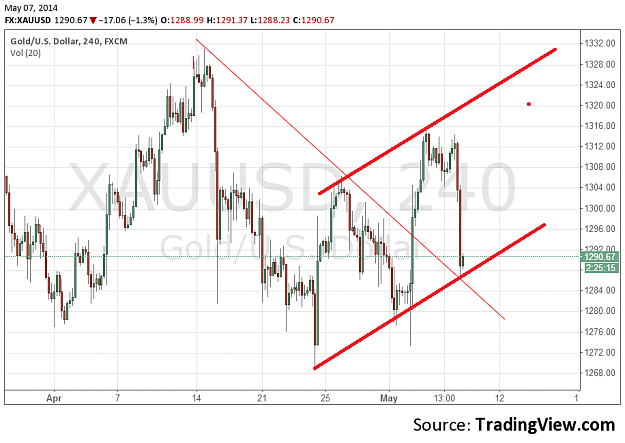
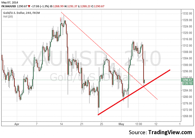
- Super_Mario replied May 7, 2014
Or even channel image I like drawing lines too, apart for that never helped...
Only Gold!
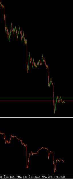
- Super_Mario replied May 5, 2014
I see another hidden divergence
Only Gold! image (Red bottom "indicator" is cumulative differences between buy and sell market orders)
- Super_Mario replied May 3, 2014
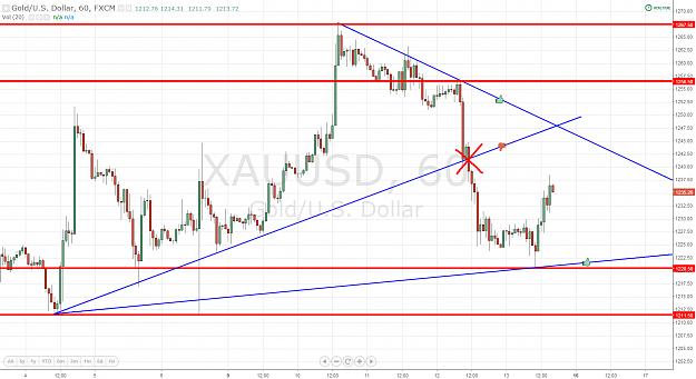
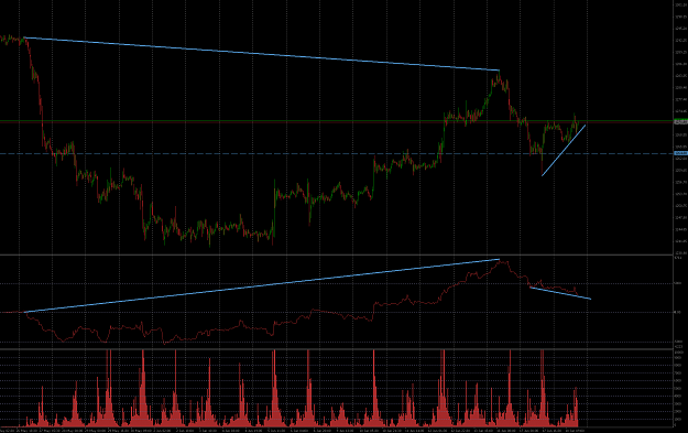
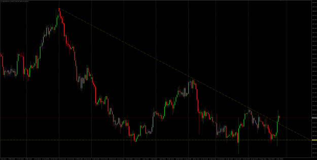
TA adepts, is this triangle break? Or since this is "descending" triangle it should break it in south direction, not north ? image
Only Gold!
- Super_Mario replied Apr 30, 2014
Hi guys! Some work for brains : image Wish everyone profitable end of session !
Only Gold!
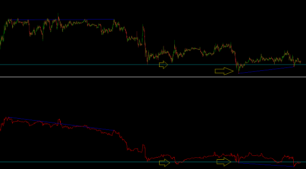
- Super_Mario replied Apr 29, 2014
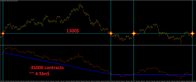
Leaving this chart here, in case anybody has similar POV image I remind - the bottom "indicator" is cumulated difference between "buy by market" and "sell by market" orders.
Only Gold!
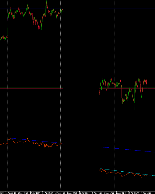
- Super_Mario replied Apr 23, 2014
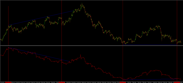
I'll just leave these two charts here. image image The bottom red "indicator" is cumulative difference in trade volume between "buy by market" and "sell by market" orders.
Only Gold!
- Super_Mario replied Apr 16, 2014
I will just leave this here in case anyone wants a kickstart for brainstorming image Bottom "indicator" is cumulative difference between buys and sells done "by market"
Only Gold!
- Super_Mario replied Jan 6, 2014
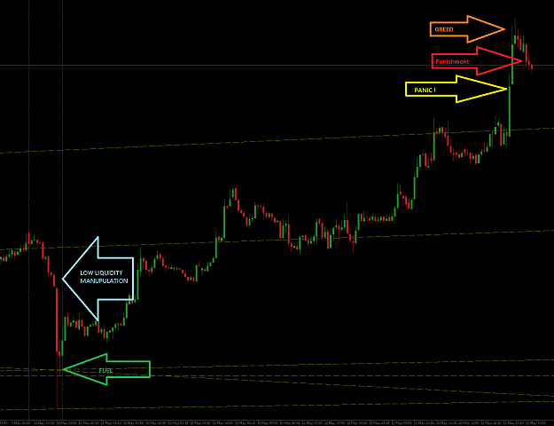
What a nice bull-killer trick. All the 1:500 leverage lovers got their margin calls
Only Gold! image