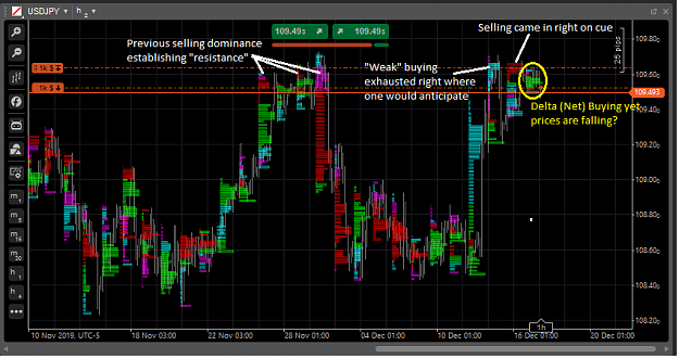
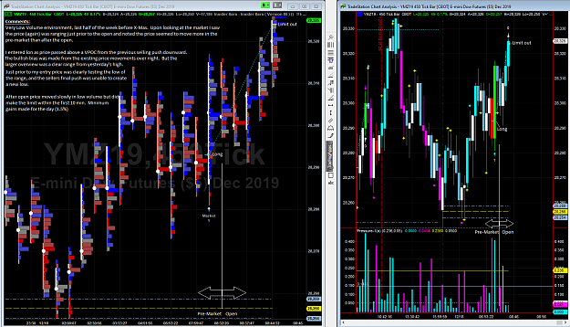
DislikedHello again KennerU. Forgive me (still on my cell). However I would like to point out to you why I think your 2nd posted screenshot shot is a more accurate view of the order flow. On a bearish candle that breaks below the opening range (marked below with the number 022). You can see some buying that was overcome by selling when the range broke. This is not present on the same candle in your first screenshot. As well in the large bullish candle that breaks higher you can clearly see the buying tapering off. This is typical of sudden large moves as...Ignored
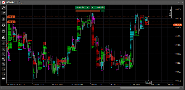
DislikedAs for the difference between the same price level on different time frames, this would simply be the result of more order flow over the same area that is seen on a larger time frame. Again I see this same thing in futures. A small time frame divides the order flow into numerous bars, each with a slightly different order flow/volume profile and would look markedly different when all combined together in a single (larger) time candle.Ignored
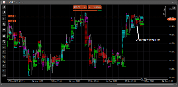
DislikedAdjusting the calculation to fit your idea of what it "should" look like may have other unintended consequences.Ignored